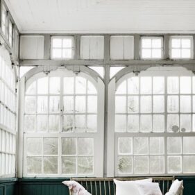
Why we love Pantone’s Color of the Year 2019
Its that time of year again! That’s right — with the New Year upon us, its time we take notice of the new Pantone Color of the Year, or risk being stuck back in 2018. Gasp! While many of us are still happily rocking the “Millennial Pink” — the popular name associated Pantone’s 2016 pick “Rose Quartz’ — theres a new pink in town, and this one is lively.
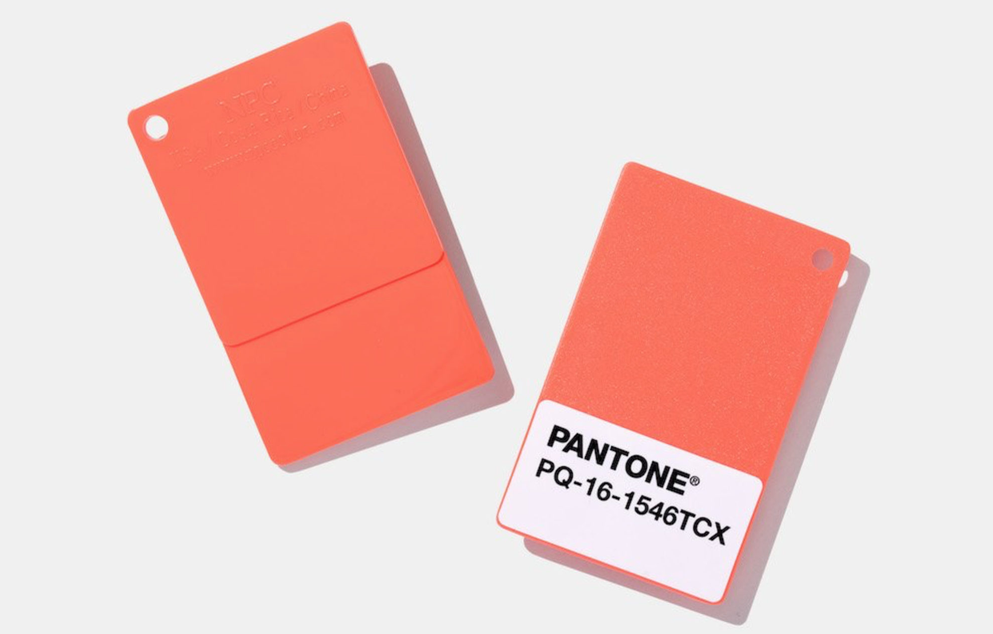
So, without further ado, feast your eyes on Pantone’s 2019 Color of the Year — Living Coral. (16-1546)
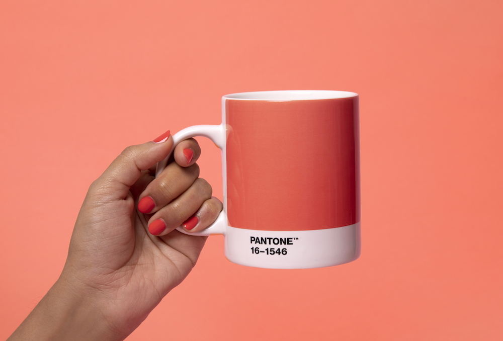
Isn’t it lovely? Isn’t it lively? I have the feeling we will be seeing this one for a while.
This years color choice offers a deeper dive into color psychology, claiming that “Living Coral emits the desired, familiar, and energizing aspects of color found in nature…in reaction to the onslaught of digital technology and social media increasingly embedding into daily life, we are seeking authentic and immersive experiences that enable connection and intimacy. Sociable and spirited, the engaging nature of PANTONE 16-1546 Living Coral welcomes and encourages lighthearted activity. Symbolizing our innate need for optimism and joyful pursuits, PANTONE 16-1546 Living Coral embodies our desire for playful expression.”
Off the cuff, this seems like a load of marketing fluff….but, however coincidentally, as I sit writing this I am staring at a coral-drenched sunset sky, and I cannot help but feel energized. The coral hues wash my surroundings with bright orange, red, and pink, and eventually give way to the blues and purples of twilight. Crickets chirp incessantly. A sense of interconnectedness abounds. When I think back to other times I’ve experienced these colors in nature, I immediately think of a coral reef. Glowing beneath the ocean surface in the mottled sunlight, buzzing with life and activity. I think of walking through a rose garden full of fresh blooms of pink, or opening up a ripe grapefruit to reveal the sour-sweet center, and I get it. This color IS exactly as described – lively, energizing, connecting, authentic, immersive, intimate.
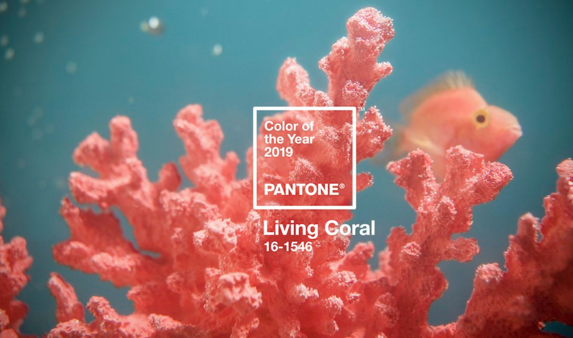
Described as “an animating and life-affirming coral hue with a golden undertone that energizes and enlivens with a softer edge”
Considering the ways in which we naturally experience coral colors in the world, its no wonder that the hue is said to make us feel happier. In fact, when considering where coral lies on the color wheel, color theory and psychology would suggest that this tertiary color is the perfect balance between stimulating red and revitalizing orange. The addition of yellow adds warmth and and air of lighthearted fun. Studies have shown that color, much like music, does in fact impact our mood and behavior, so it is important to consider this when choosing where to include coral in your home.
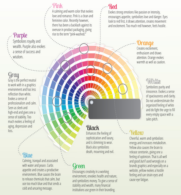
The color wheel along with basic color psychology
Living Coral’s ability to be both stimulating and soothing make it a perfect color to use in any room that needs an extra boost of life. This color is said to enliven conversation, spark joy, encourage interaction, and aid in digestion. Think dining rooms, entry ways, and powder rooms. Coral is also a very universally flattering color, so if you’re looking to surround yourself with color that places you in the best light, this may be a good choice. Slight tweaks to the hue, depending on your skin tone will do the trick- think more pink/red coral for cool skin tones, and more orange/yellow coral for those on the warm end of the spectrum.
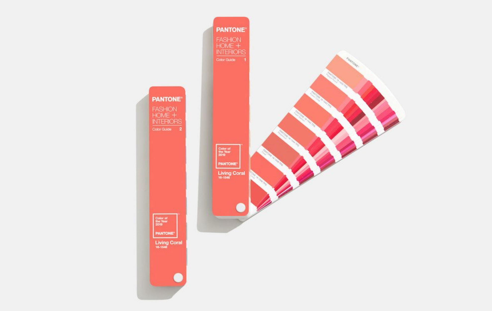
Living Coral Analogous Color Swatch
Pairing coral with other colors throughout the home can be tricky. Remember to keep it simple, and stick with complimentary, split-complimentary, and analogous colors for fantastic results. Check out some great uses for this exquisite color here. Happy Hue-ing!

