3 Keys to Effective Office Design
originally published on MyGreetly.com with permission
Office design is an often overlooked aspect of a company’s business plan. Unless your business is dining or hospitality, the design is typically an afterthought. What most business leaders don’t realize is that the design of your office has a tight correlation to the productivity level of your employees and on the first impressions you give to prospective or existing customers.
As an architectural designer, I focus on modern commercial design for cost-conscious business owners and property investors. I need to make a big impact with a limited budget. For office environments, I prioritize high foot-traffic areas like the front desk (A.K.A. “reception magnet”) to get the most bang for the buck. Being mindful of a few key details during the design process can lead to the big impacts my clients seek.
Functional Design
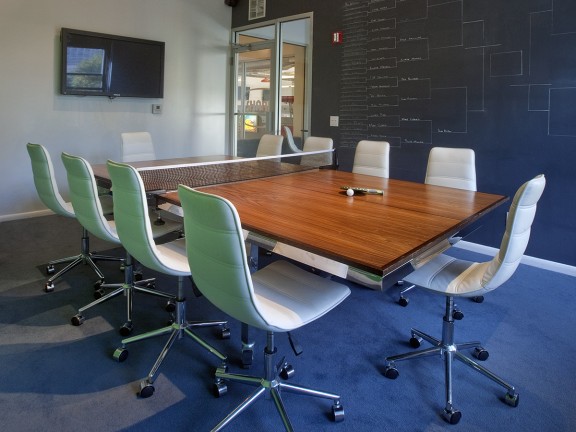
Successful office design starts with understanding the client’s business functions. It’s a key difference between residential architecture and commercial architecture. In residential architecture, architects ask whether the client has people over, what they do in their spare time when they’re at home, where do they like to watch TV, etc. It informs the design decisions so clients aren’t stuck with a space that doesn’t serve their needs.
For commercial office design, I ask questions like:
- “What types of employees will work here?”
- “Will you meet with customers at your office?”
- “Who are your most common visitors?”
- “What hours are you open?”
- “Do you have a full-time receptionist?”
Once I get a feel for the business operations that will take place in the commercial space, I can start to create a functional design. Great design will seamlessly marry the typical business functions with the features of the office space.
Many architects would say that their role is to solve problems for their clients. If business meetings typically consist of people using computers, make sure conference rooms don’t have windows with glare. If employees have morning “stand-ups,” create space and recommend furniture that can be multi-functional for standing up or sitting down. If a company doesn’t have the budget or space for a full-time receptionist, design front desk areas with receptionist apps like Greetly iPad receptionist.
Space Planning
Space planning is a crucial step to any successful design. By doing precedent studies (studying architectural precedents), and utilizing design elements from other effective spaces, I can create an environment that truly accomplishes a set of brand objectives. For a forward-thinking, tech-savvy, collaborative office environment, I create lots of open spaces that foster open communication, and enrich those spaces with clean, contemporary elements like glass and stainless steel.
When worker productivity is a primary objective, I can design accordingly. For offices that have highly paid employees such as computer programmers, senior creative artists and VP’s, I create a functional yet aesthetically pleasing buffer from common, unnecessary distractions. A lot of marketing agencies and tech companies share this objective, though productivity is becoming a more and more important facet to each commercial project architects work on.
Aesthetics
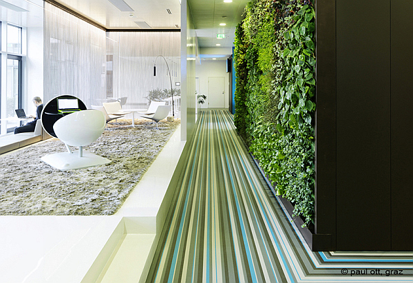
The design component to commercial architecture is the polish, or finishing touch to executing a successful project. Picking the right can make the space planning and functional design elements seem effortless for occupants and visitors. That means design elements that fit the brand, and thoughtful accents to highlight key functions in a subtle, sophisticated manner.
Wayfinding is a technique that architects use to convey direction and guide people through the space without having explicit signage, such as a “Ring Bell For Assistance” sign. Apple is notorious for using a form of “wayfinding” in their physical product design. While the “Home Button” on the iPhone could have words next to it indicating “push this button for home,” that would be aesthetically displeasing. Instead, they chose to use a square on the button to indicate its utility (the iPhone 6 omits the square to illustrate the fingerprint recognition technology). It’s the perfect pairing of form and function.
Summary
With the right assessment of a business’s operations, an exhaustive search of the solutions available in the market and detail-oriented, thoughtful architectural design, great things can happen in your space.


